

Imagine arriving at a public building in your wheelchair and finding only stairs…no ramp, no lift. Or a heavy door with a push-bar you can’t reach. The problem isn’t you; it’s the design.
Accessibility means building environments, physical and digital, so people with disabilities can perceive, understand, navigate, and use them without extra help.
The same principles apply in learning experience design. If a learning experience has unclear structure, relies on colour alone to create meaning, or can only be clicked with a mouse, it creates ‘stairs’ in the digital world. Without clear markers and predictable layouts, doing a course can feel like walking into a dark hotel room and having to guess where everything is. When we design for accessibility from the start, the experience simply works – for everyone.
.png)
Unfortunately, many Learning Experience Designers and E-Learning Developers still create courses with an ‘average learner’ in mind. This imaginary person can see, hear, type, and process information at a typical pace. The problem is, this so-called ‘average learner’ doesn’t actually exist. By designing for a fictional norm, we end up excluding anyone who learns differently, whether that’s because of disability, language, culture, or simply a different way of processing information.
In the digital world, accessible designs serve a range of differing needs such as:
Let’s have a look at some of the most common accessibility mistakes out there, and how to avoid them.
Interactive elements like drag-and-drop activities, hidden hotspots, or timed quizzes can make a learning experience feel dynamic and engaging. But when they can only be completed in one way, by dragging with a mouse, typing long paragraphs, or racing a timer, some learners are immediately shut out.
A learner with limited motor control or low vision may not be able to drag items across a screen (W3C, 2024). A deaf learner with lower reading confidence may struggle to type a written paragraph but could easily express themselves in British Sign Language (BSL).
Timed quizzes assume that all learners can process information, read, and respond at the same speed. For learners with dyslexia, ADHD, autism, or those using screen readers, the pressure of a ticking clock can mean they never get to demonstrate what they actually know.
In practice, the timer ends up measuring reaction speed, not learning.
A better approach is to design activities so there is more than one way to take part. For example, in a project where we collaborated with Self Help UK, learners had the option to record and upload a short video of themselves signing a response in BSL instead of writing a paragraph. This kept learners motivated and included those who express themselves best in sign language.
When interactions aren’t inclusive, learners with cognitive, motor, speech, hearing, or vision-related differences are excluded from the experience altogether. Here are some tips for designing inclusive activities:
.png)
Some learners rely on assistive technology to use digital content. These include screen readers, switch devices, or alternative keyboards. A screen reader is software that reads aloud what’s on the screen and lets learners who are blind or have low vision move through text, menus, and interactive elements using their keyboard. Typically, they would tap the Tab key or use screen reader commands to jump from one item to the next.
The sequence in which the screen reader moves from one item to the next is called the focus order.
For learners who are blind, have low vision, or limited mobility, a clear, predictable focus order is essential. And here’s where layout matters: depending on the technology you use, the way you design and arrange elements on screen often determines the order in which a screen reader or keyboard navigation will encounter them. If the layout is messy or illogical, the focus order will be messy and illogical too. Empirical studies and user-centred research on screen-reader users show navigation and semantics (headings, landmarks, order) are critical for comprehension and way-finding (Jordan et al., 2024).
Some tools automatically generate long lists of invisible ‘tab stops’ from decorative elements or poorly structured layouts. This can leave learners stuck tabbing through empty space before they ever reach meaningful content.

Keep layouts simple, avoid unnecessary objects, and where possible, use built-in accessibility features (like labelled form fields or properly tagged headings) instead of custom workarounds. Here are some specific things to focus on:
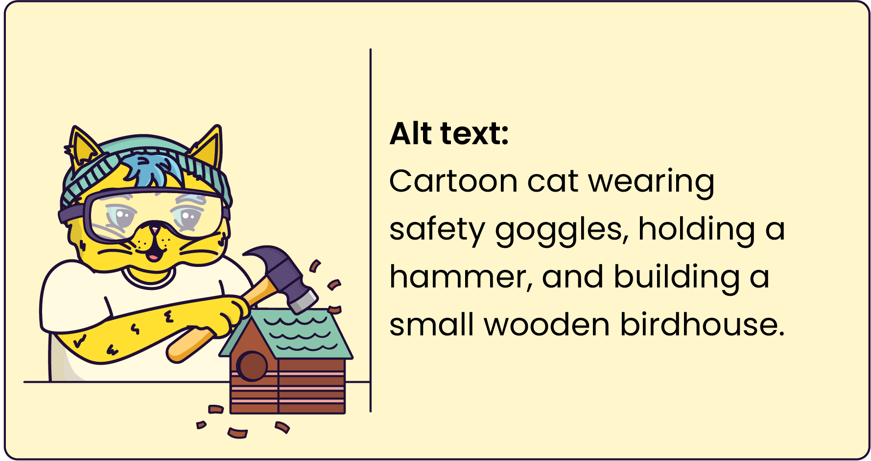
Images in learning experiences aren’t just decoration; they explain ideas, reinforce concepts, and help information stick. For learners with low vision, we can add a zoom function for highly detailed images to ensure they can follow along. But for learners who can’t see, that meaning is lost unless it’s described in audio form. That’s where alt text comes in.
Alt text is a short description that tells learners what’s happening in an image. Done well, it ensures learners who are blind, have low vision, or use screen readers can fully access the meaning and purpose of the image.
When alt text is missing, vague, or irrelevant, you’re shutting learners out entirely. Worse, inaccurate alt text can teach the wrong thing, leaving learners confused or misinformed.
Here are some specific things to focus on:
Captions and transcripts make video content flexible, usable, and more effective for everyone. But first, what’s the difference between captions and transcripts?
When videos don’t have captions or transcripts, many learners are left out. Learners who are deaf and hard-of-hearing can’t access the content at all. Learners who are blind miss important visual information unless it’s described in a transcript. Second-language speakers, people who learn better through reading, or anyone in a noisy environment also struggle to follow along.
Here are some specific things to focus on:

Colour is powerful! It’s an important tool we use to create meaning in our learning experiences. But, it needs to be used with care. When it comes to colour, there are two main accessibility mistakes to watch out for:
Here are some specific things to focus on:

Accessibility isn’t just about the tech stuff; it’s also about making content easy to understand. Every learner deserves simple copy presented in consistent and easy-to-read typography.
When learning experiences are packed with dense jargon, chunky paragraphs, and flowery fonts, it can overwhelm learners, especially those who think or process information differently (Gernsbacher, 2015).
Here are some specific things to focus on:
Built-in LMS checkers, browser plugins, and WCAG validators are useful for spotting obvious issues such as missing alt text, low contrast, or incorrect heading structures. They save time by flagging common errors, but they only go so far. These tools can’t tell you if your focus order makes sense, if alt text is meaningful, or if your interactions are actually usable with assistive technology.
We also have to be mindful of different contexts of use. What works on one screen reader may fail on another. A design that looks fine in Chrome on a laptop may behave very differently in Safari on a phone, or break when learners zoom in to enlarge text. Without real-world testing across browsers and devices, barriers remain hidden.
Here are some specific things to focus on:

Accessibility isn’t about ‘going the extra mile’ – it’s about meeting expectations. Without it, learning experiences exclude learners with disabilities.
Everyone deserves content that works well, feels good to use, and respects their time.
The good news? Inclusive design benefits all learners. Captions support deaf users, but they’re also very useful to anyone learning in a noisy space and people who are learning in a language in which they are not entirely fluent. High-contrast text helps people with low vision and makes reading easier for everyone. Keyboard navigation empowers screen reader users and multitaskers alike.
When you design with accessibility in mind, you don’t just meet requirements; you create a learning experience that’s smoother, smarter, and better for everyone.

