

Colour theory is the science and art of using colour intentionally. It helps us understand how colours relate to each other, how they affect emotion and perception, and how to combine them to create balance and clarity.
In a learning context, colour impacts:
Colour also plays a powerful role in how we retain information. Some scholars believe that colour improves memory performance by enhancing attention, increasing emotional arousal, and supporting encoding and retrieval processes (Dzulkifli & Mustafar, 2013).
In other words, colour isn’t just aesthetic; it can help learners focus and remember.
Before choosing a colour palette, it helps to know the basic building blocks of colour:

These properties work together to shape the overall tone of your design. For instance, highly saturated colours can energise a screen, while low saturation can create a more calm, neutral atmosphere.
Warm colours (like red, orange, and yellow) tend to feel energising and attention-grabbing. They’re useful for drawing focus, such as in buttons, alerts, or important messages. Cool colours (like blue, green, and purple) feel calming and professional. They’re great for information-dense screens, background elements, or reflective activities.
There’s no perfect formula; just remember to align your choices with the emotional tone and function of the learning content.
Once you know your colours, it helps to choose a palette structure. A few options include:
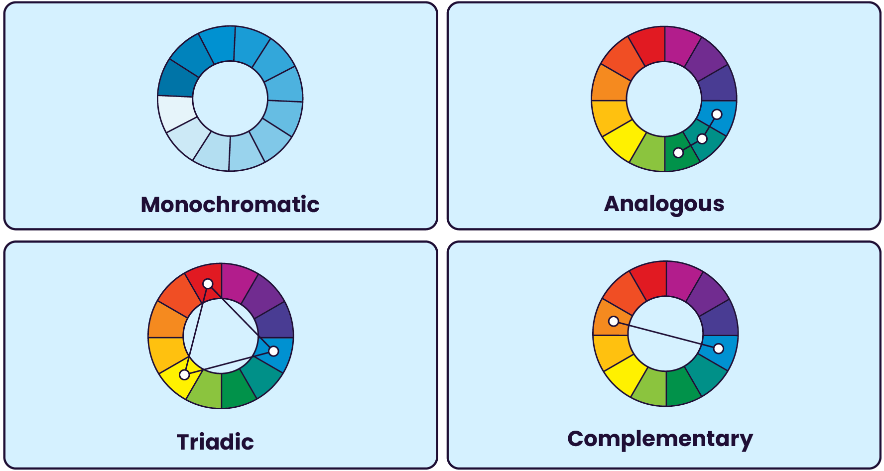
Each structure has a different effect. Complementary palettes offer high contrast. Analogous schemes are more subtle and harmonious.
Choose a structure that fits the mood and message of your content.
Here are some practical ways to use colour intentionally in your learning experiences:

Stick to a small set of brand or theme colours to reduce clutter and improve focus. A typical palette might include two primary colours, one accent colour, and one or two neutrals. Avoid using too many bold or saturated colours that fight for attention. Neutral backgrounds and limited accents help content shine.

Interaction cues should stand out clearly, using a strong accent colour. Don’t change your “clickable” colour halfway through a course. Choose one, distinct “clickable” colour and use it consistently.

Use colour to signal importance. For example, key headings could use your primary colour, while body text stays neutral. However, to ensure your content is accessible, be sure that colour is not the only way you signal importance or hierarchy (more on that later).

Colours can carry different meanings across audiences. For example, red may symbolise danger in some contexts and celebration in others. If your learning will reach a global audience, do a quick check for regional interpretations.

Calm, reflective content (e.g. mental health or well-being) might benefit from cool, muted colours. High-energy training (e.g. sales, onboarding) might use warmer, more saturated colours to motivate action.

Not all learners perceive colour the same way. To design for inclusion, check that:
Try free tools like the WebAIM Contrast Checker or browser extensions like the WAVE Evaluation Tool to test your designs.
Also, keep in mind that many brand colour palettes were created for marketing rather than learning. They often prioritise aesthetics over accessibility. If you’re working with a brand that doesn’t meet WCAG colour guidelines, look for compliant combinations within the existing palette, or propose a modified "learning brand" version with adjusted values and combinations that are easier to use in educational environments.
Starting from scratch? Try these tools for inspiration:
Just remember to test every palette for accessibility before you start building.
Colour in learning experience design isn’t just about making your content look good. It’s about improving clarity, usability, and experience. When used with intention, colour can guide learners through your content, reduce friction, and reinforce the tone of your message.
So next time you open up your authoring tool, don’t just pick what "looks nice." Use what works.

