

Creating inclusive, interactive museum installations for Iziko’s Humanity exhibit.
‘If you get bored quickly and like a bit of variety and spice in life, this company is for you.’ That line in our job specs sums us up perfectly. We look for people who thrive on stepping out of their comfort zones, who love a challenge, and who find it hard to sit still. Projects that push us to grow have always been a priority, which is why designing two educational installations for Iziko Museums’ Humanity exhibit felt like such a natural fit.
Most of the time, our work lives in the digital world. We design interactive learning experiences that sit on screens and reach learners across continents. This project was different. The digital installations we created for the ‘Humanity’ exhibit now live in the physical world, to be touched, explored, and experienced by thousands of museum visitors of all ages and abilities.
It was an opportunity to test our skills in a new way: Could we design inclusive, interactive experiences that worked in a physical space?

The Humanity exhibit, a collaboration between Iziko Museums and the Human Evolution Research Institute at the University of Cape Town, was designed as an immersive journey through time. Its goal: to tell a fresh story of human evolution that centers Africa and celebrates our shared heritage.
The exhibit challenges outdated, linear narratives and instead presents evolution as a complex braid of biology, technology, and culture across different times and places. It is both a celebration of Africa’s role in human history and an invitation for visitors to reflect on our interconnected past.
You can check out the Humanity exhibit at the Iziko South Africa Museum in Cape Town.
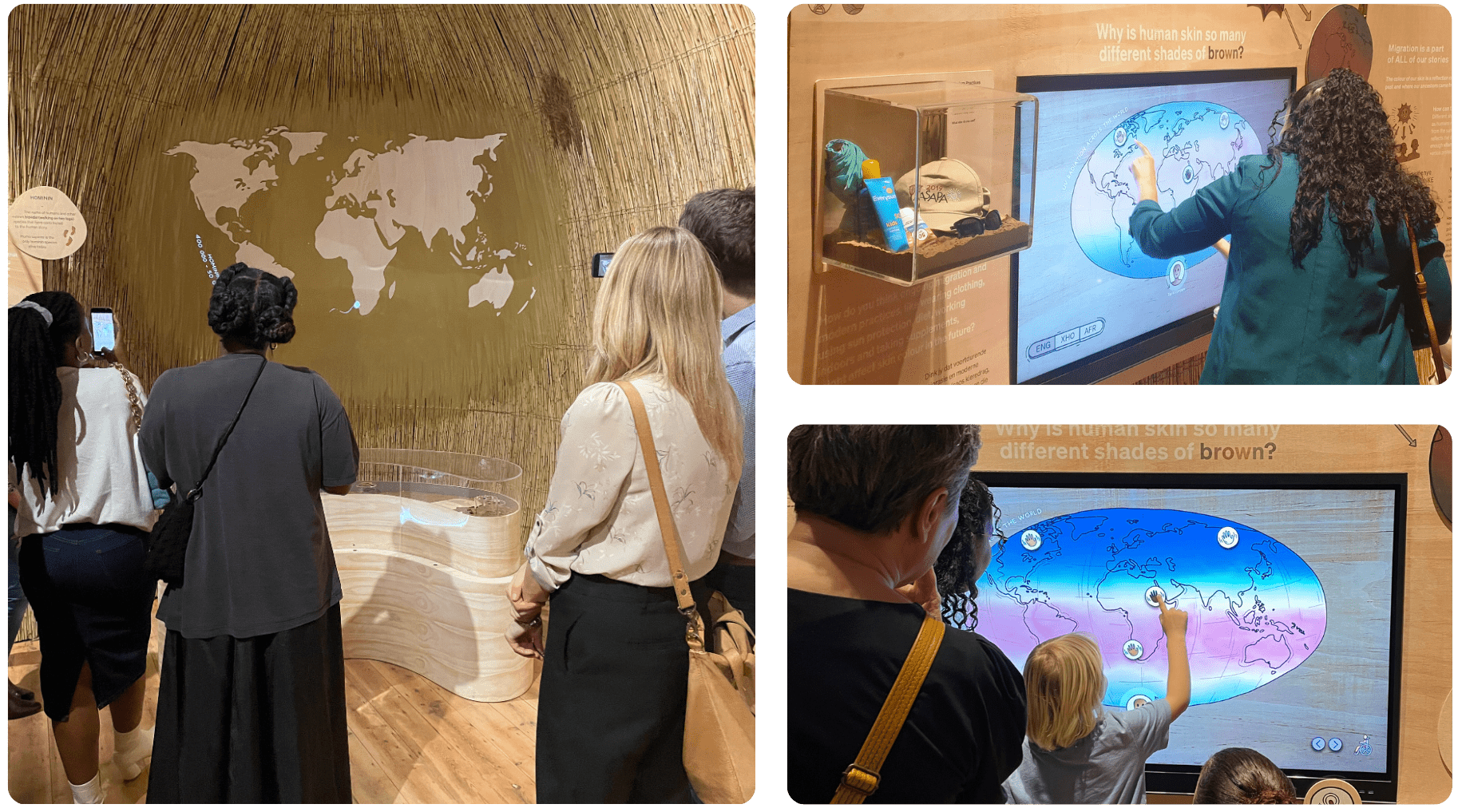
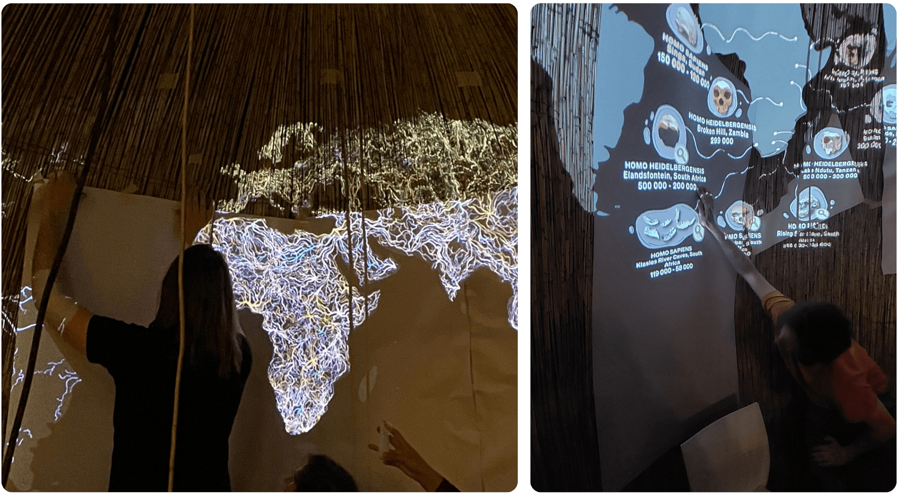
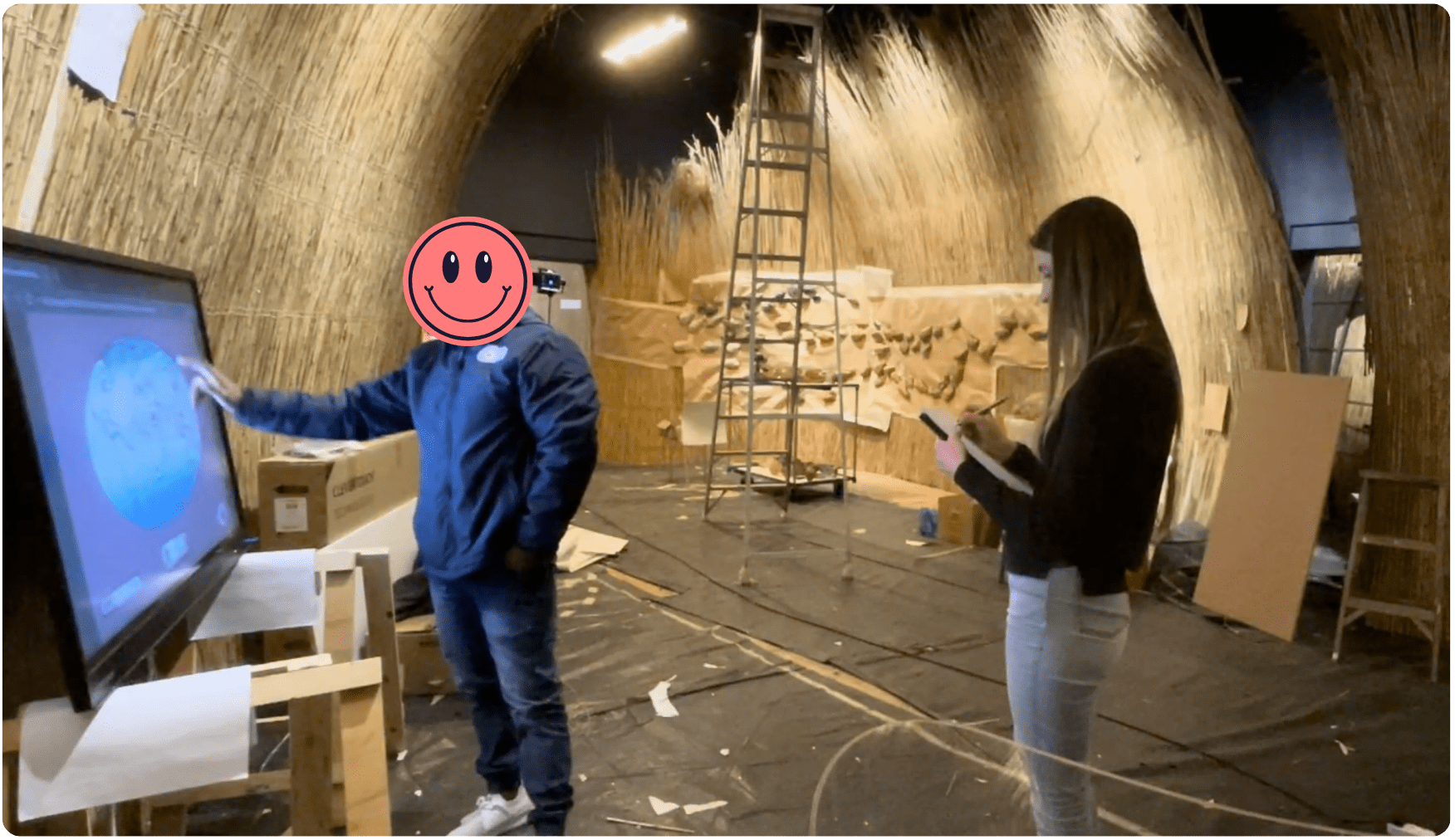
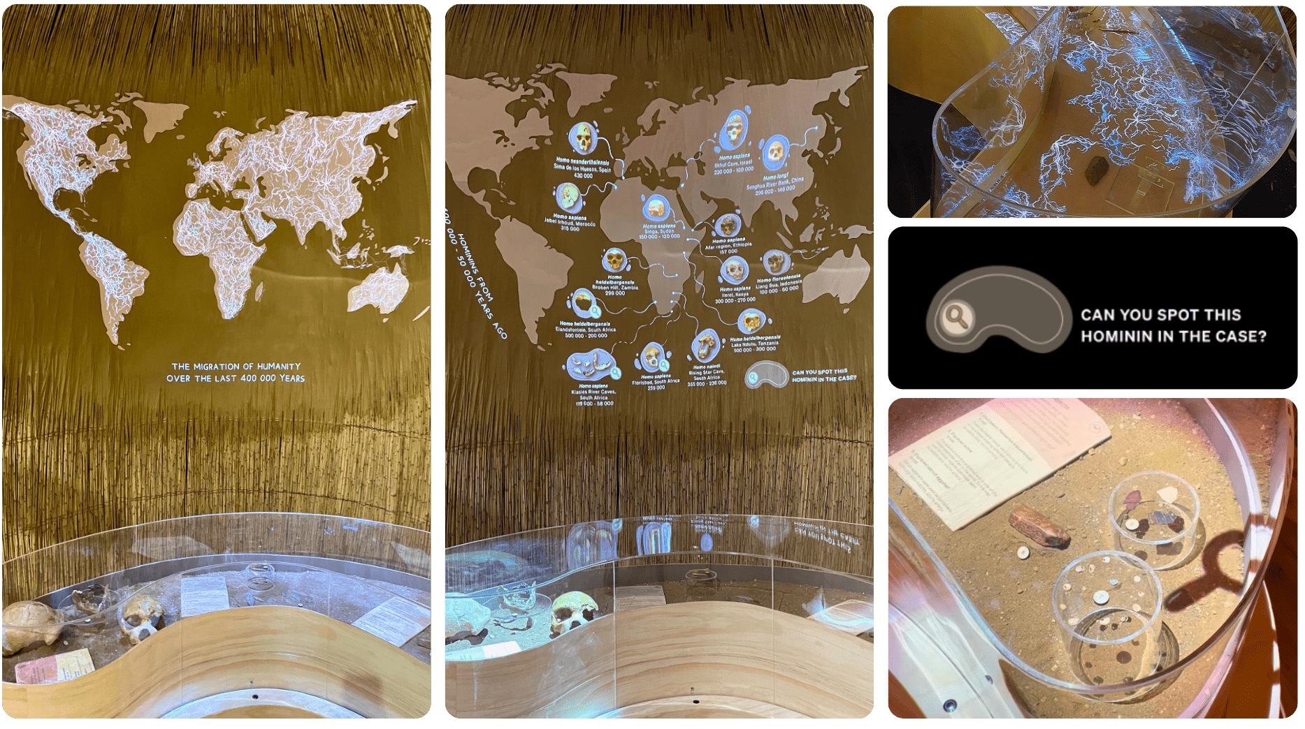
One of our installations was a projection-mapping interactive centered around a textured, curved wall with a display case in front of it. We developed projection-mapped videos to show humanity’s migration pathways, and how we deduced these pathways from the artefacts our ancestors left in their wake over thousands of years.
The task was ambitious: to show that Homo sapiens did not evolve from a single ancestor but from many influences, woven together like strands of a braid.

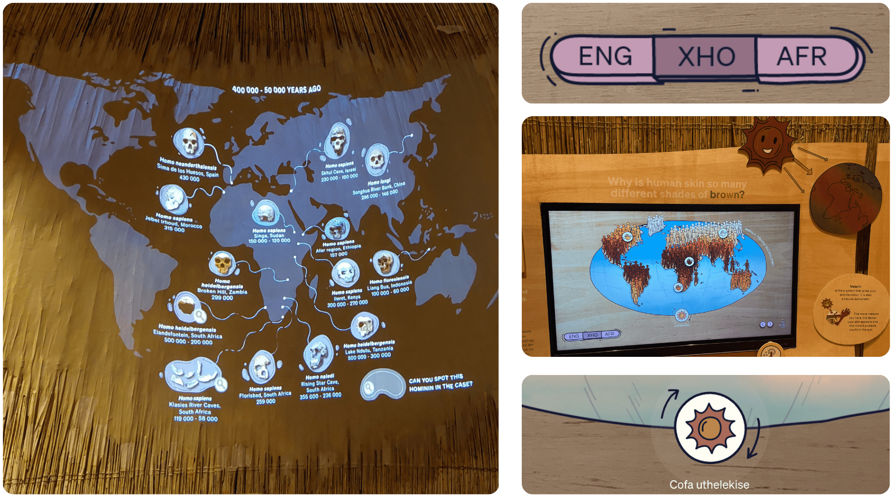
The display case holds three groups of artefacts: hominid skulls, symbolic objects, and tools, all left behind by our common ancestors as they migrated through Africa. Each group of artefacts has its own button. When a visitor presses a button, the artefacts light up inside the case, and an animated video plays on a flat plywood world map mounted to the curved, reed-clad wall behind it. This allows visitors to learn more about each artefact in the case, and draw connections between the migration pathways and artefacts.
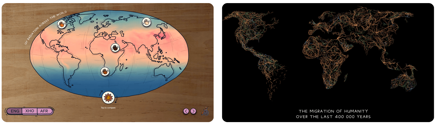
We worked closely with curators to ensure these animations are a faithful representation of humanity’s migration across the globe from 400,000 years ago to the present, showing where the highlighted artefacts were found and how they fit into our collective story.
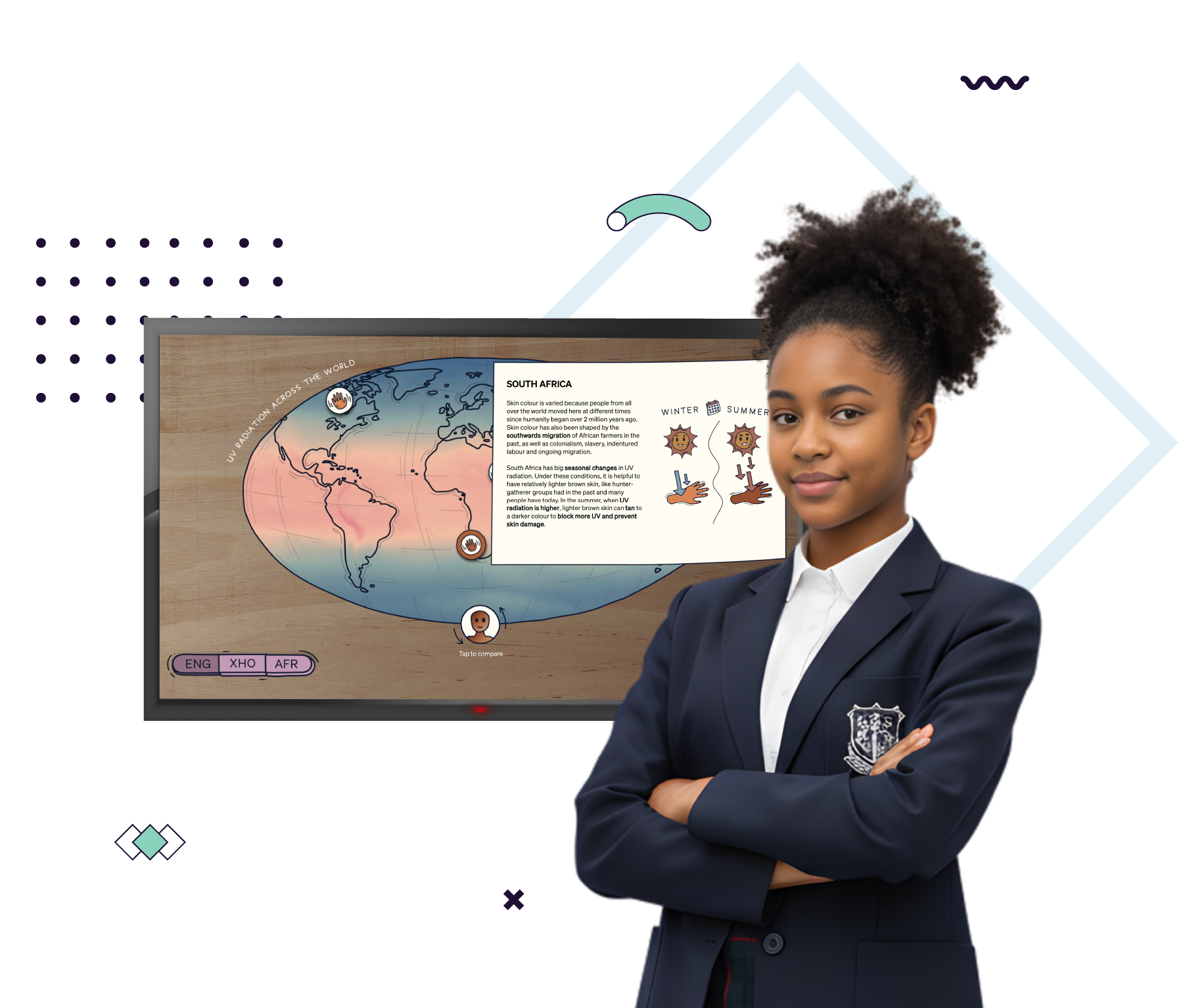
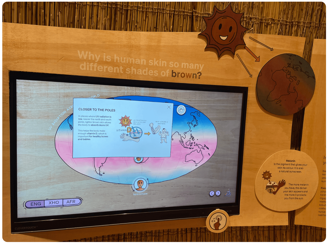
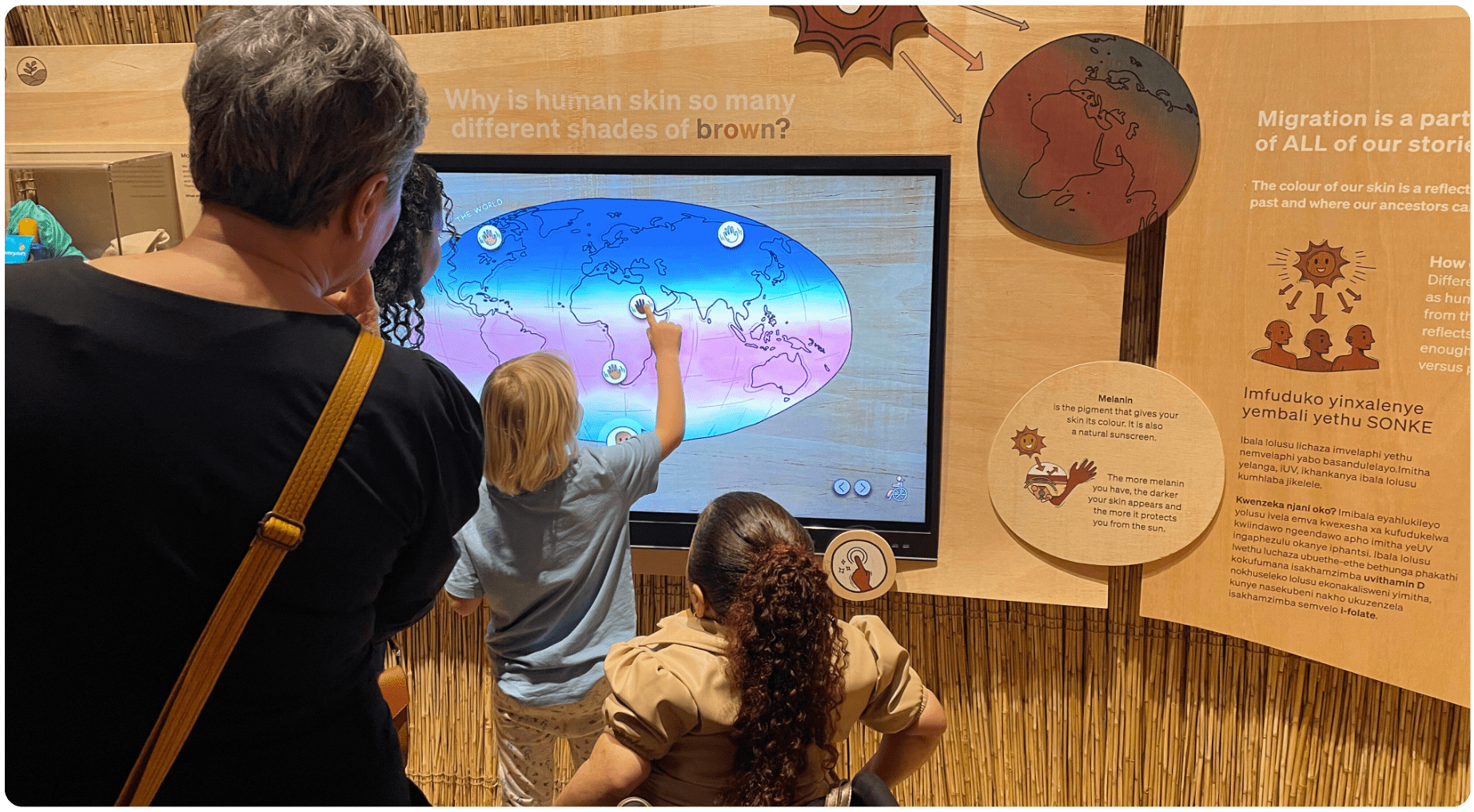
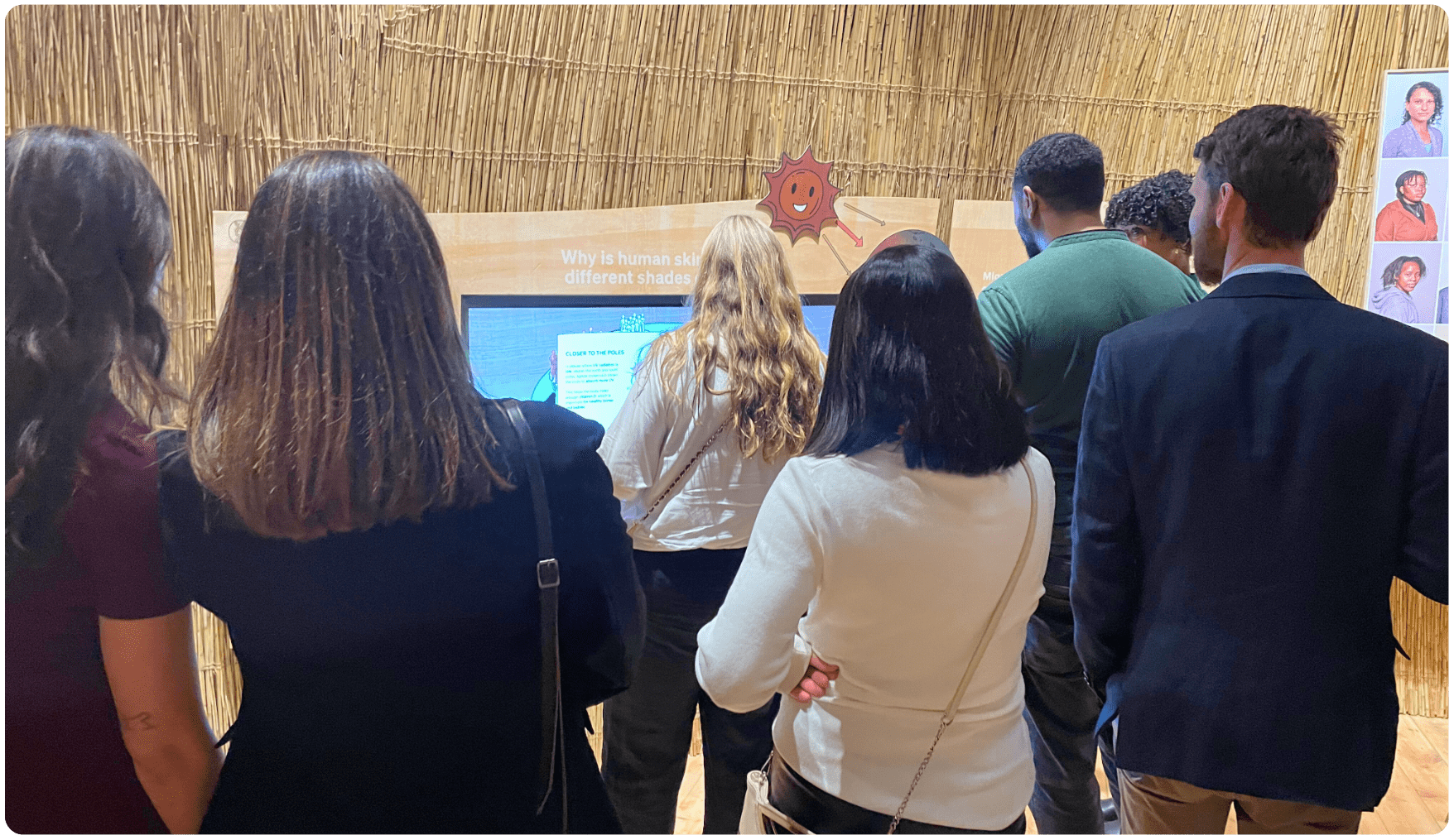
Our second installation explores the relationship between skin colour and UV radiation. Visitors can toggle between maps on an interactive touch screen, alternating between human skin tones and UV radiation levels to observe the patterns in their distribution across the globe. They can also click on specific regions to learn about how our diet or seasonal changes created anomalies in these patterns. To ensure accessibility and inclusion, the interaction is available in three languages that can be switched at any time.
Creating interactive digital learning experiences that exist as part of a physical museum exhibit is exactly as complicated as it sounds. Here’s the two core design challenges we encountered:
Let’s explore how we tackled these challenges, and the lessons we learned along the way.
Usually, our e-learning experiences are used by one person at a time. Meaning, one screen per person. In a museum context, visitors of all ages are walking past the displays in different directions, pressing buttons as they go.
So, the concept of linearly progressing them from a ‘start’ to an ‘end’ – a mindset Learning Experience Designers are deeply entrenched within – no longer applies.
In a physical installation, it needs to be possible for Charlie the 9-year-old to run off to the next cool thing after a few seconds, and for Yusuf the 60-year-old to pick up where Charlie left off and still be able to make sense of what they are looking at.
This challenged us to, for both the projection-mapping and the touch-screen interactives, redesign the original concept into an alinear experience. A visitor could be captured by any part of the interactive and still be able to draw meaningful connections. We did this using two key tools:
In the projection-mapping interaction, the case full of objects and their associated buttons organised the information. In the touch-screen interaction, the map of the world and its various points of interest did the same. The visitor could only ever go one layer ‘deep’ into the experience and would either automatically get back to the ‘menu’ or be guided there with one tap or button press.

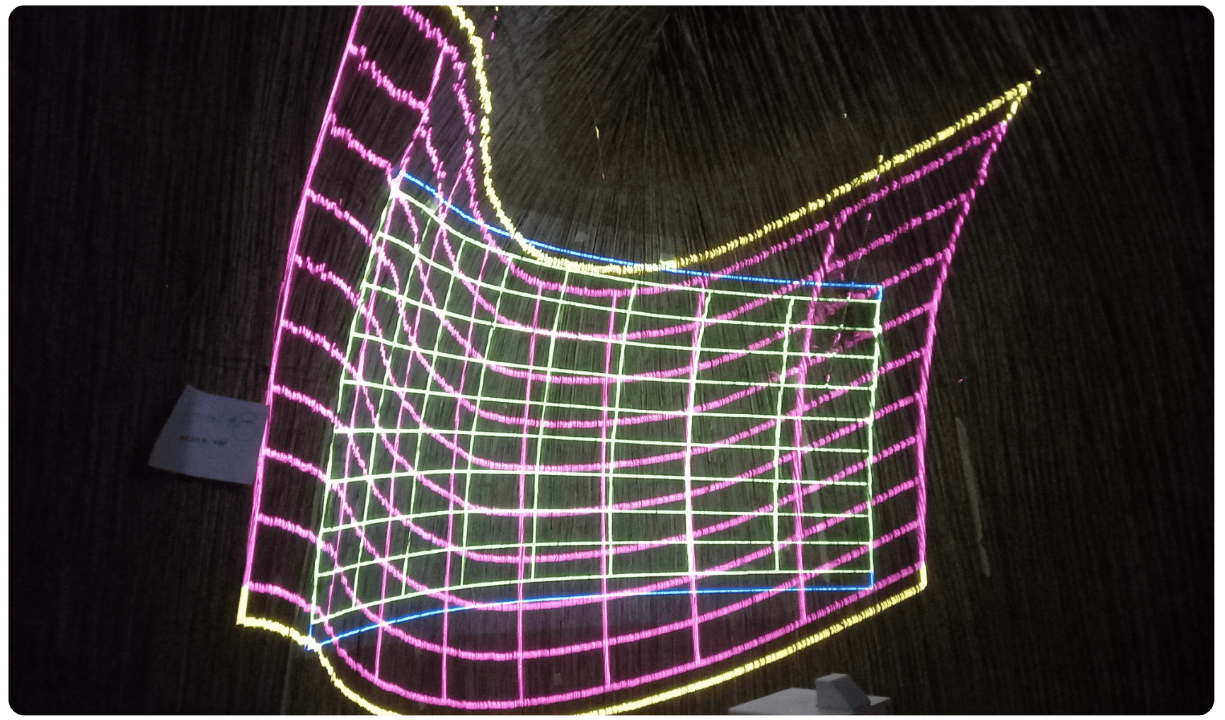
We also ensured that both interactives had an interesting ‘idle’ state to capture the attention of visitors walking by, so that it could spark curiosity even when no-one was interacting with it. The projection-mapping interactive shows a rhizomic timeline of different humanoid groups’ migration across the globe until a user presses a button, while the touch screen plays a video we painstakingly generated from a year’s worth of UV values in colourised form.
We are fairly confident in our abilities to design inclusive experiences in the digital world, but doing so in a physical space adds a new layer of complexity. Suddenly, issues we rarely face on screens, like projection contrast, lighting, wall texture, and visitor body height, were front-and-center. Some of the biggest challenges we faced included:
Our migration map had to be projected onto a curved wall clad in reeds, which immediately raised issues of visibility and contrast. Subtle colours disappeared into the reeds, and fine details blurred.
To solve this, we smoothed part of the wall with fire-resistant paper-mâché and mounted a laser cut bendy plywood map over this to create clearer projection surfaces. We then refined the visuals by increasing colour saturation so the migration routes stood out more strongly. Because the same colours appeared differently on the brown paper-mâché versus the plywood, we made fine-tuned adjustments by eye, balancing hues so that the projection looked consistent across both surfaces.
Text presented an entirely different challenge. Projecting onto a curved surface meant that letters warped and lost clarity, especially at larger angles.
The solution required both precise calculations and plenty of intuition-based adjustments, changing font sizes, leading, and angles until the text appeared undistorted and legible from the visitor’s perspective. Much of this was done by eye, testing and tweaking until the text felt natural on the curved wall.

A core principle for us was that the installations needed to be accessible to as many visitors as possible, regardless of height or mobility. We carefully selected a mounting height for the touch screen so it could be reached comfortably by children, adults, and people using wheelchairs. We also added secondary navigation controls at the bottom of the screen, so that popups could be navigated even if a visitor could not physically reach the top of the interface.
One of the difficult parts of this project was ensuring the digital interactives felt integrated with the style of the exhibit. This style was conceptualised to shun the industrial materials and geometric leanings of Western modernity and instead embrace long-standing African traditions involving hand-crafted organic shapes and materials.
The projection-mapping interactive was already primed to solve this problem, as it was designed to follow the curve of the reed cladding rather than being presented on a rectangular screen like videos usually are. However, our design approach and the touch screen also needed careful thought. We tackled this challenge in two ways.
First, our visual design of the videos and the touch screen UI leaned into the organic setting by using hand-drawn shapes, handwritten-style fonts, and asymmetrical layouts to avoid the rigid, geometric feel inherent to most UI designs.
Second, we blended the touch screen directly into the wooden panel it was mounted onto by photographing the cut-out piece of wood, editing the image, and using it as the interface background. This let the grain and tone align with the surrounding wood, so the interactive became a natural extension of the exhibit rather than a disruption.
Even thoughtful design decisions are still assumptions until they’re tried out with real people.
We knew we needed to test our installations on real visitors to learn what worked and what needed to be rethought.
The subject-matter itself is also sensitive, so we needed to understand if we were communicating the core messages with the appropriate level of nuance. Even though we adhered to universal design best practices throughout, user testing and observation was imperative.

True to our ‘test early and often’ philosophy, we began testing during the prototyping phase, using feedback to refine the exhibits and pivot as needed. Our focus was on two key areas:
To find out, we recruited a small but diverse group that reflected Iziko’s audiences: children, teens, adults, and older visitors of varying races and nationalities. It’s lucky that there are two high schools so close to the museum, even if some learners got a bit of a fright when two strange women ran after them with offers of reward for their time.

Using the think-aloud method, we asked participants to narrate their thoughts while interacting with each exhibit. This gave us valuable insight into their hesitations, assumptions, and moments of discovery.
Two facilitators observed, taking notes and asking open-ended questions afterward. Once testing was complete, we organised the feedback into themes that guided our refinements.
User testing challenged our assumptions and revealed valuable insights that directly shaped the final exhibits:
These lessons reminded us that inclusive design isn’t just about adding features like larger fonts or translations, it’s about shaping an experience that feels natural, clear, and rewarding for as many people as possible.
Designing educational experiences for a museum context is radically different from designing for digital learning alone. In EdTech, users are usually on their own device, and often in control of pace and environment. In a museum, visitors arrive in groups, move through spaces together, and bring expectations shaped by years of ‘look but don’t touch.’
Exhibits must work for casual browsers as well as deeply curious learners, for children and adults alike, often all at once.
User testing bridged the gap between our design intentions and real visitor behaviour. It forced us to:
The biggest payoff came on opening night, when we stood back and watched visitors press buttons, toggle maps, and point things out excitedly to each other. The exhibits weren’t just being used, they were being shared and talked about.
That moment underscored why testing isn’t just a box to tick, it is what makes inclusive, engaging experiences possible.

The process taught us that inclusive design is less about following a set of rules and more about listening to users, adapting to environments, and staying open to change. We left the project not only with two installations we are proud of but also with a deeper understanding of how to carry inclusive, user-tested design into new contexts, whether digital, physical, or somewhere in between.

