
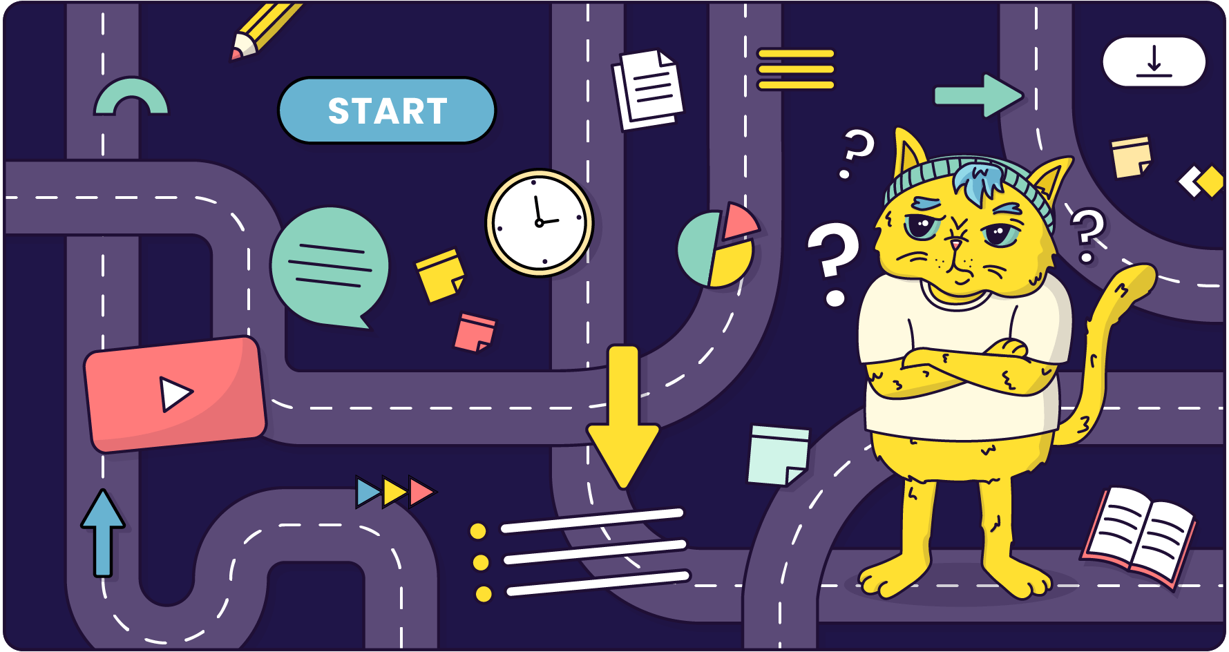
Let's be honest, we've all been there. It’s Monday morning. You’ve got your coffee. You click the link to a mandatory new e-learning course, and you’re instantly plunged into a digital nightmare. The welcome page has seventeen buttons, none of which are clearly labelled 'Start.' A sidebar menu lists topics in an order that seems to have been determined by a cat walking across a keyboard. You click on 'Module 1: Introduction,' only to be presented with a downloadable 98-page PDF and a video titled final_version_3_updated.mp4.
This, my friends, is what happens when e-learning has bad Information Architecture (IA). It's the digital equivalent of being handed a car engine in a bucket of bolts and being told to ‘go for a drive.’ The parts might all be there, but without a blueprint, without structure, you're not going anywhere. The only thing you're learning is new depths of frustration.
So, what exactly is this mystical concept that stands between a clear, engaging learning experience and a digital labyrinth of despair?
Put simply, Information Architecture is the art and science of organising and structuring content in a way that helps people find what they need and understand where they are.
It's about creating a clear, intuitive, and, dare we say, enjoyable path through your digital content. It's the silent framework, the invisible scaffolding that holds your learning experience together. Before you even think about fancy graphics and layouts (User Interface, or UI) or the overall emotional journey (User Experience, or UX), you need the solid blueprint of IA.

You're not just a content creator; you're an architect of knowledge. And a huge part of that architecture is how easily your learners can navigate and make sense of the information you're presenting. Good IA isn’t just a 'nice to have'; it's fundamental to effective learning.
Think about it through the lens of cognitive load. Our brains have a finite amount of working memory. When learners are wasting precious mental energy just trying to figure out how to use your learning experience – deciphering cryptic icons, hunting for the next lesson, trying to remember where they saw that one crucial PDF – they are piling on extraneous cognitive load. This is the mental baggage that has nothing to do with the actual subject matter.
Good IA strips extraneous cognitive load away, allowing learners to dedicate their full brainpower to what actually matters: mastering the content.
The godfathers of IA, Peter Morville and Louis Rosenfeld, famously outlined the key components of this discipline. Let's see how their foundational principles apply directly to crafting e-learning that doesn't make people want to throw their laptops out the window.
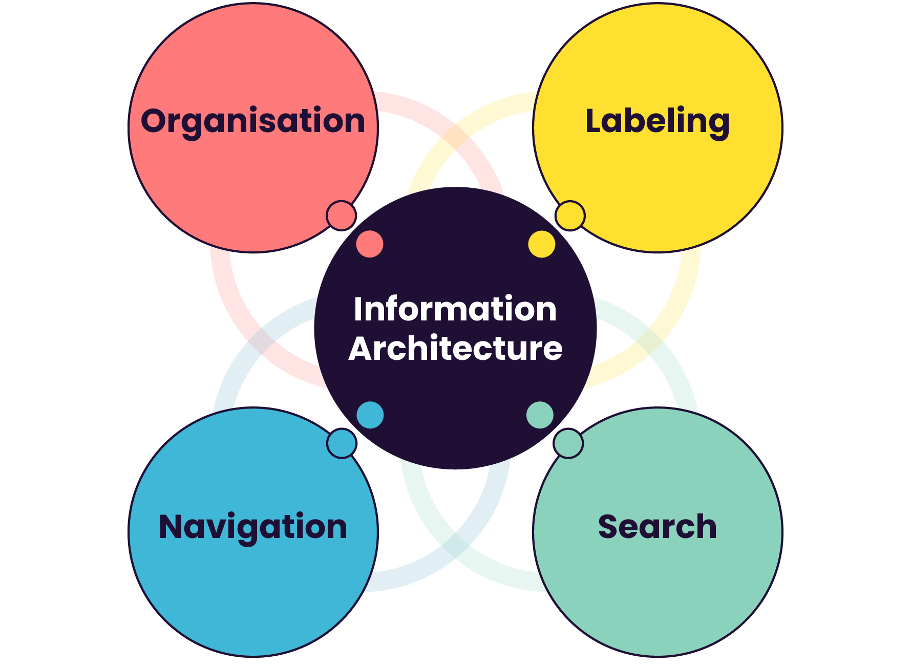
This is the big one: how you group and categorise your content. It’s the difference between a logical, well-organised library and a chaotic book-hoarder's garage. Choosing the right scheme depends entirely on your content and your learners.
The key is to structure your content in a way that matches your learners' mental models – how they already think about the subject.
What do you call things? Are your labels clear, concise, and consistent? If you label a button 'Resources' on one page, 'Documents' on another, and 'Job Aids' on a third, you're creating micro-doses of confusion that add up to a major headache.
Good labeling is about speaking your learner's language. Avoid internal company jargon and acronyms like the plague. The new hire in accounting has no idea what 'Project Synergy Q3 deliverables' means. Call it 'Quarterly Financial Reports.'
A good label sets a clear expectation of what the learner will find when they click.
Be descriptive but brief. 'Module 1' is okay, but 'Module 1: Understanding Your Customer' is infinitely better.
Navigation is how people move through your e-learning experience. It’s the system of menus, links, and buttons that acts as the learner's guide.
The golden rule of navigation? Don't make the learner think.
It should be obvious where they are, where they've been, and where they can go next. Breadcrumbs (e.g., Home > Module 2 > Lesson 3) are a fantastic tool for this.
For any course or learning experience of a significant size, a robust search function is non-negotiable. We are all conditioned by Google to solve our problems by typing them into a box. When a learner needs to quickly find that one specific video on handling difficult customers, they shouldn't have to manually browse through six modules to find it.
A good search system is more than just a text field. It should be forgiving of typos, spelling variations, understand synonyms (a search for 'salary' should also find results for 'compensation'), and ideally, offer filters to help users narrow down the results (e.g., by format, topic, or module).
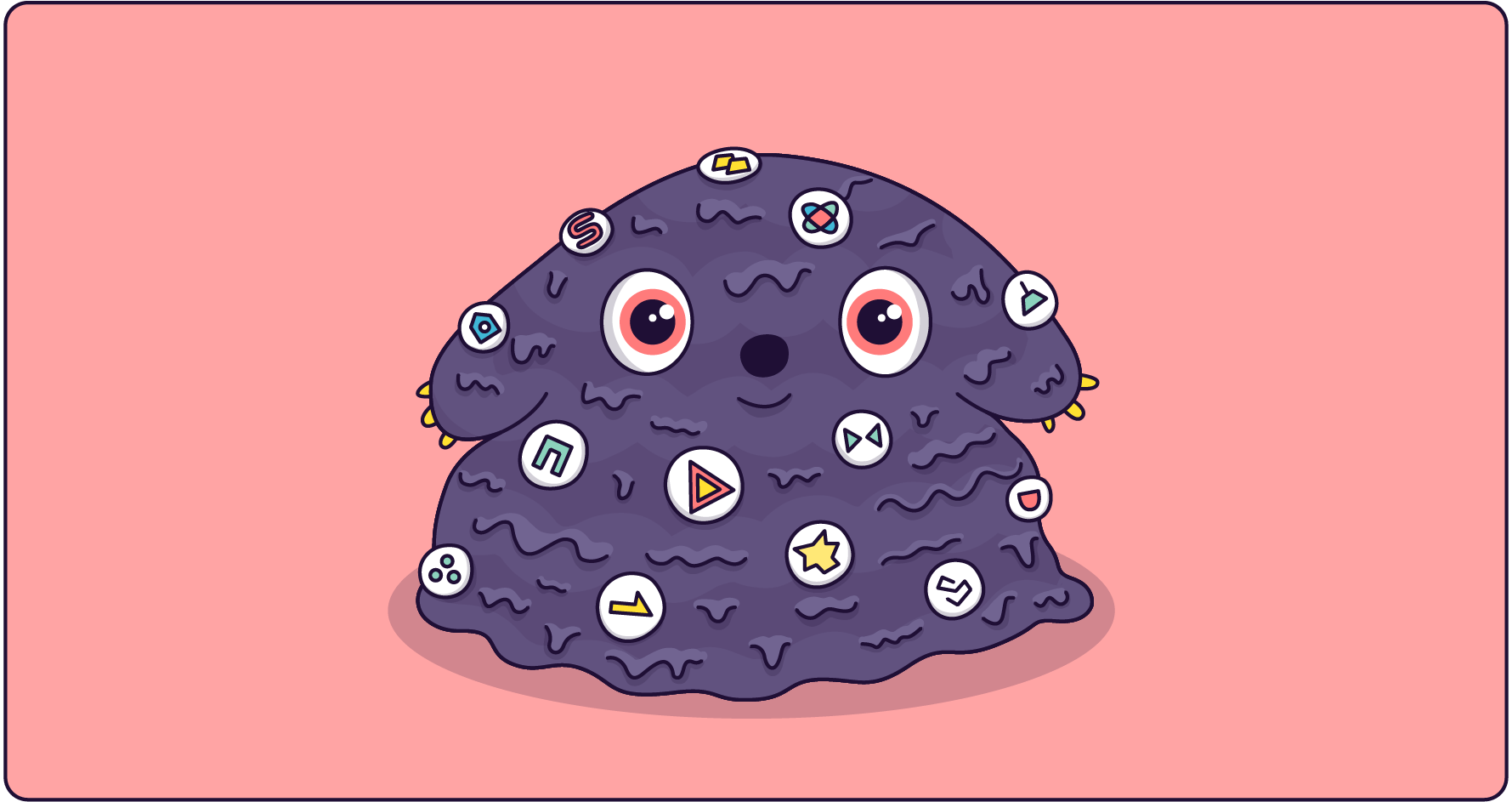
We've all seen learning experiences that fall victim to these classic blunders. Let's give them the names they deserve.

This is the most common sin. The subject matter expert gives you a 2GB folder filled with PowerPoints, Word docs, and videos. The 'design' process consists of uploading all of it into a single 'Course Materials' folder on the LMS. It's not a course; it's a file cabinet, and you've just made the learner the intern responsible for sorting it.
This design trend favours minimalist, 'clever' icons over clear text labels. What does the icon of three overlapping circles mean? Is it 'Community,' 'Resources,' or 'Summon an Ancient Demon?' The learner has to click on everything just to find out what it does, which is both inefficient and infuriating. Always pair icons with clear labels.
This learning experience was clearly written by insiders, for insiders. It’s riddled with company-specific acronyms and technical terms that are never defined. It alienates new learners and creates an immediate barrier to understanding. A simple glossary can fix this, but better yet, write in plain language from the start.
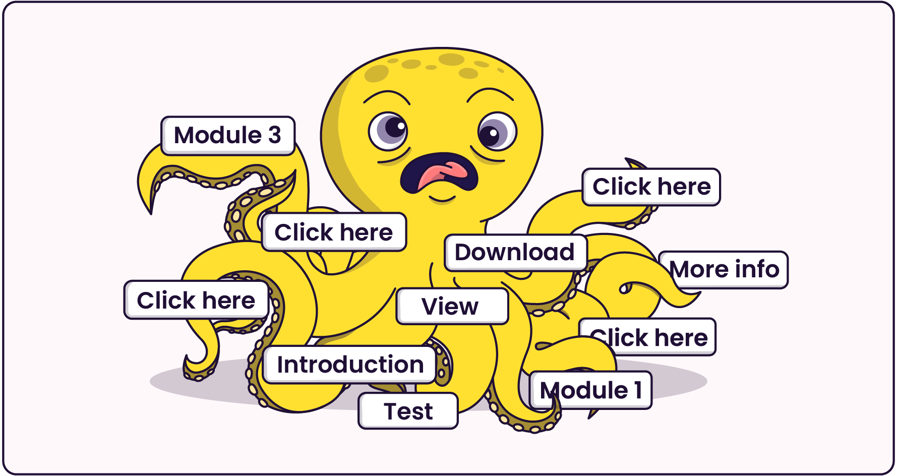
This happens when a course has no clear hierarchy. There are links shooting off in every direction, contextual links that lead to other contextual links, and a navigation menu with 30 top-level items. The learner is paralysed by choice, a phenomenon known as Hick's Law, where the time it takes to make a decision increases with the number and complexity of choices (Hick, 1952).
Ready to bring some order to the chaos? Here are some actionable steps you can take to build a solid information architecture for your next e-learning project.
By embracing your role as an information architect, you can move beyond simply creating content and start designing experiences that are clear, effective, and maybe even a little bit delightful. You can build a learning experience that respects your learners' time and intelligence, guiding them smoothly toward mastery instead of leaving them lost in a maze of your own making.
Hick, W. E. (1952). On the rate of gain of information. Quarterly Journal of Experimental Psychology, 4(1), 11–26.
IDEO.org. (n.d.). Card sort. Design Kit. Retrieved August 8, 2025, from https://www.designkit.org/methods/card-sort.html
Morville, P., & Rosenfeld, L. (2006). Information architecture for the World Wide Web (3rd ed.). O'Reilly Media, Inc.
Spencer, D. (2009). Card sorting: Designing usable categories. Rosenfeld Media.

