
All too often, the principle of consistency becomes an all-consuming force that demands sacrifices. And usually, we're the ones making the offerings. Let’s take a look at how myths around consistency can damage our learners’ ability to process and retain information.

Our first sacrifice is the most important one: memory formation.
Do you sometimes walk into a room and immediately forget why you're there? Then you might even go back into the previous room to fetch your thoughts? ‘Oh yes, I was looking for my water bottle; better try carrying that idea all the way into my office this time!’
Or, maybe not. Maybe you’re more organised than I am, but you do tend to tell the same story to your long-suffering passengers whenever you drive past a particular building. It’s because you’ve got memories tied to specific spaces.
This phenomenon is explained by behavioural psychologists as the ‘doorway effect’, which is part of a broader theory known as Event Segmentation Theory (Radvansky & Copeland, 2006). This theory posits that our minds segment continuous experiences into distinct events. Crossing a physical or even a conceptual boundary acts as an ‘event boundary,’ which can trigger the mind to archive the previous event's memories, making them less accessible (Radvansky & Copeland, 2006).
Think of these as events that tell our brains to create a new ‘box’ in which to store information and put stuff into those boxes. Your brain might then store that box in the 'garage' (long-term memory) somewhere once it thinks we’re moving on to a new box (event).
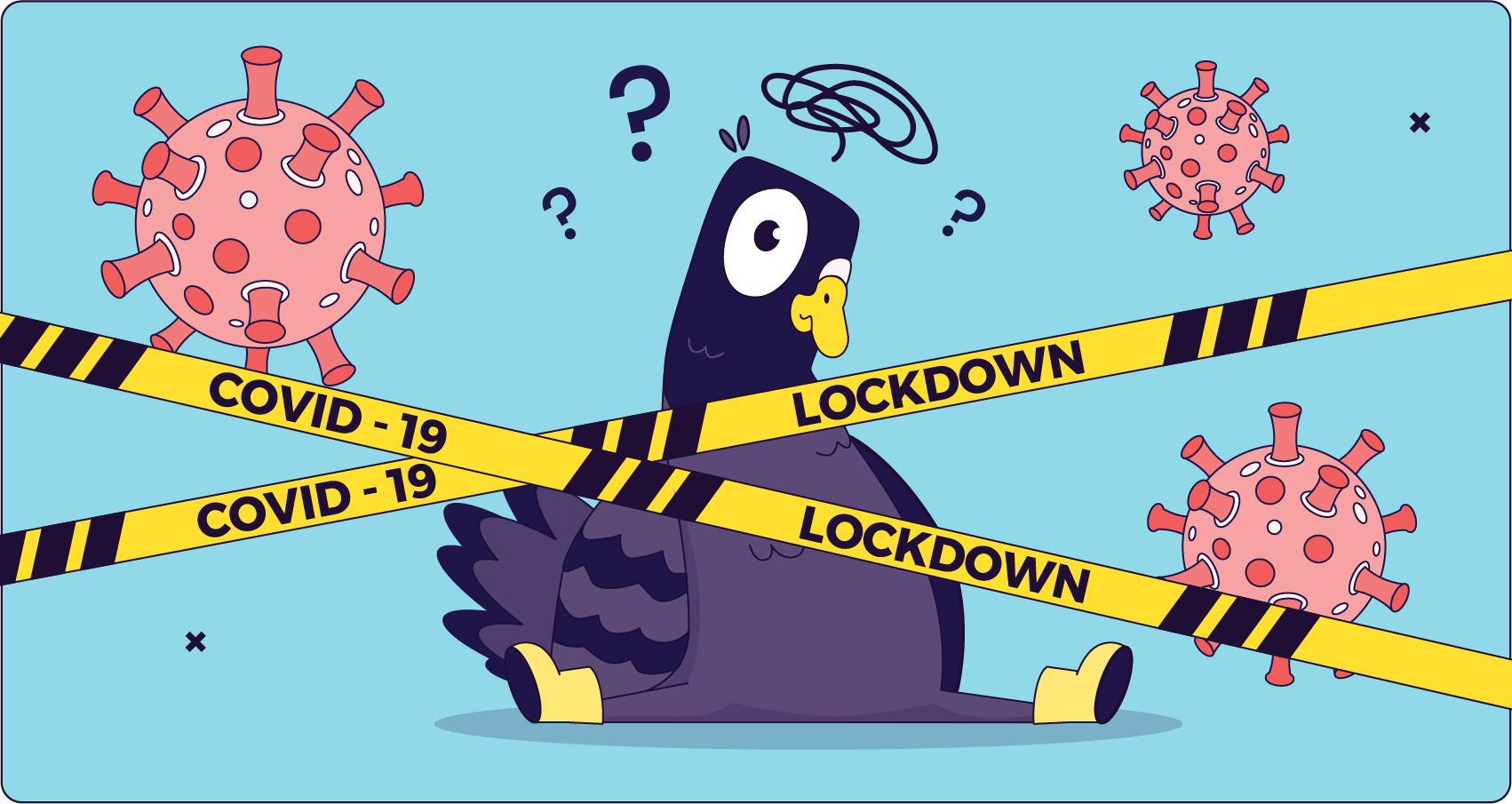
This is why time seemed to pass so quickly during the covid-19 lockdown; we were interacting with the same people in the same spaces, and as a result we formed very few memories. (To be fair, trauma also had a say there.)
Well-researched examples of boundary-forming events in a multimedia context include:
Because I'm a former film scholar, much of my knowledge on the subject does come from the world of moving pictures and how to make them memorable. But it stands to reason that we should create cognitive boundaries with intention in learning experiences as well, to help our learners retain information.
When everything looks the same, it can be challenging for anything to truly stand out. The background colours stay the same, the characters are the same. The lecturer is the same. Soon, the learner is asking, ‘Haven’t I been here already? Didn’t I just look at this table/face/pattern a few minutes ago? Meh, then I don’t need to store it again.’
And that’s when the mythical value of consistency can become our enemy. Too much consistency can make it difficult for learners to get their brains to: 1. create new boxes to store new ideas and skills, and 2. put information in those boxes. I’m over-simplifying, but that’s really the gist of it.
Some of you might say, well, that’s why I’ve chunked it up into tiny 5-minute lessons. So the learners create a new box in their brain for ‘Lesson 2’. To you I say: If Lesson 2 looks, feels, and is structured in ways that are super similar to Lesson 1, you’re not helping. Well, not much, anyway. Semantics boundaries can only get us so far.
Some more effective ways I’ve come up with to introduce more ‘chaotic good’ into our learning experiences:
Use these tools to ‘divide up’ your learning experience into distinctly different chunks.
This point is closely related to that of cognitive boundaries, so I’ll keep it short.
Too much consistency in our designs can not only make things harder to remember, it can also make it very easy for learners to gloss over a key point because it looked so similar to all the non-key points.
A critical message getting lost due to uniformity relates to a memory principle called the Von Restorff effect (or the isolation effect).
This effect demonstrates that an item that is distinct or stands out from its neighbours (e.g., a word in a different colour, a unique image) is significantly more likely to be remembered. (Parker et al., 1996).
Consider, for example, when you have a truly critical message – say, a vital safety warning like, ‘This machine will literally explode if you touch the red button.’ It might end up having the exact same visual prominence as, ‘Remember to hydrate.’ Because, you know, consistency. There was one type of note-block approved for this template, and that’s the one we’ll use.
.png)
Sounds a bit silly, right? This kind of argument doesn’t have a place among people who really want to help others learn, realise their potential, and not explode their machines. Remember to temper consistency with her slightly more personable sister, contrast, when necessary.
Next on the altar is ‘engagement’. I really don’t like the word ‘engagement’ because it often seems to refer to everything important yet nothing in particular, so let me explain what I mean in this instance.
As a Learning Experience Designer, I want to be able to offer variety, novelty, and thought-provoking interactions to learners, because chances are they won’t get bored quite so quickly. I’m competing with TikTok, here.
Using novelty and variety to combat boredom and maintain engagement is supported by theories of curiosity and interest in learning. Research shows that novel stimuli can trigger curiosity, which in turn enhances attention and motivation (Pekrun, 2006). To achieve this goal, I might use dynamic simulations, intricate gamified challenges, or collaborative problem-solving scenarios. The good stuff.
But then, the question arises: “Have we ever done that before? Does it fit our standard 'Question Type 3B' template?" And sometimes, an innovative, immersive simulation becomes… another multiple-choice quiz. Or a static ‘click-to-reveal’ activity. Because it's consistent. We’ve always done it that way.
Our learners might end up with a more predictable, perhaps even repetitive, experience. And don’t get me wrong – for some learners that is definitely the right choice. But it should be for a good reason. Because they are tech-hesitant, or something, not simply because we're scared to introduce something new that might not perfectly align with established norms.
Where you can, champion that new idea for a cool, meaningful interaction. Don’t squash it because there isn’t a template for it… yet.
Our final offering on the altar of consistency: Innovation. Sometimes the mythos of consistency can act as an anchor, holding back progress. The style guide, perhaps conceived years ago, might dictate specific design elements that feel… out of time. We might also have learned that our UX is not the best, and that our service desk is flooded with students who can’t find the ‘submit’ button.
We might envision incorporating fluid micro-interactions, beautiful parallax scrolling, or even a dark mode option for learners' tired eyes. Yet, the established stylesheet can stand in the way. ‘It's not in the style guide,’ we're told. ‘Our brand doesn't use gradients’ (sue me, I love a good gradient). So, while the digital world evolves, we might find ourselves consistently producing experiences that feel a little behind the curve. Worse, they might not be very user-friendly.
The number of grey buttons I see in UI designs because that’s the only colour still available is shocking. Why is it grey? It looks like I can’t click it at all! Do you not want me to click your button?
So if you’re working with a limiting stylesheet or brand, what can you do about it? Personally, I’m a big fan of challenging the brand. If it’s large and imposing I might not be able to change it, but I could make a case for a subsidiary ‘learning brand’ that better supports learning experience. Worst case scenario, I lose the argument and we move on.
So, it's clear there are genuine costs when consistency becomes the sole guiding principle. We can lose opportunities for innovation, impact, and truly engaging learning experiences.
But we can’t throw it out the window entirely; consistency is fundamentally important in many cases.
Think about navigation buttons that always appear in the same place, or the key brand colours that reliably signal your organisation. These elements build trust and reduce cognitive load, allowing learners to focus on the content, not on figuring out the interface. We should always honour consistency when it genuinely enhances usability and creates a predictable, stable learning environment.
Where we need to be discerning is when strict adherence to consistency starts to compromise learning effectiveness or stifle innovation. It's about asking: Is this consistency genuinely serving the learner, or am I using it for mythical advantages I can’t really pin down? The challenge, and indeed the art, of our role is knowing when to champion consistency for its benefits, and when to nudge against its confines to create something truly impactful.
Personally, my rule is: Consistency is a good fallback for if there are no strong arguments or other variables to guide your instructional, multimedia, or UX/UI design decisions.
Unless you are super new to the field and have no clue what you’re doing (yet!), consistency should not be your main goal. Don’t deify a set of rules that can never be challenged; let the best idea win.

