

Interaction isn’t just about clicks. It’s about thinking. Good interaction design gives learners something to do with what they’re learning; process it, test it, apply it, challenge it.
According to Mayer’s Cognitive Theory of Multimedia Learning, interactivity can reduce cognitive overload and enhance learning by prompting active engagement (Mayer, 2009).
But not all interactivity is created equal. Some of it is just noise.
Here are some guidelines for designing interactivity that supports learning instead of detracting from it.
Every interactive element in your learning experience should have a clear purpose. Ask yourself:
If the answer is no, it probably doesn’t belong.
Interactivity without purpose is just clutter.
It doesn’t respect the learner’s time and attention, and most of the time just leads to frustration and unnecessary extraneous cognitive load.
More interaction doesn’t mean better learning. A page packed with sliders, pop-ups, and nested layers becomes a cognitive minefield. Prioritise simplicity. Let the learner focus on one decision or idea at a time. Too many options can overwhelm learners. According to Hick’s Law, limiting choices can reduce decision fatigue and improve usability.
An interactive glossary? Great, if the terms are complex and unfamiliar. A spinning wheel to 'randomly' reveal module objectives? Maybe not.
One of the biggest mistakes in e-learning is building the interaction before defining the learning.
Before you touch Storyline, Rise, or another tool, ask yourself:
If your goal is to help someone compare policy approaches, perhaps use tabs. If you want them to apply a framework to real decisions, go for branching scenarios or interactive case studies.
Clicking is not the same as thinking. Match the interactivity to the learning verb, such as compare, apply, or evaluate, rather than to the authoring tool’s built-in template.
This is why it’s critical to conceptualise interaction during the storyboarding phase, not after the fact. Deciding how content is presented should not fall solely to the developer. Instructional designers should plan for interaction from the start, mapping how learners will engage with the material and ensuring each interaction directly supports the learning objective. This early alignment enables stronger collaboration with developers and leads to more intentional, meaningful learning experiences.
Think of interactivity as a form of scaffolding. It helps structure how information is delivered and digested.
Use tabs, accordions, or click-and-reveals to break complex ideas into manageable parts. This isn’t just a visual trick; it supports cognitive processing by reducing cognitive overload and helping learners focus on one piece at a time.
This supports the principle of progressive disclosure, showing just enough information to avoid overload while allowing the learner to dig deeper when ready.
Interactivity isn’t one-size-fits-all. Your learners’ tech familiarity, device usage, and media preferences should shape your design choices. Lean heavily on your learner personas to help determine what interactivity would suit your specific learners.
For example, if learners are middle-aged carers who are quite unfamiliar or uncomfortable with technology, launching them into an interactive VR simulation will likely create confusion or frustration. Likewise, if your learners are busy retail workers relying on job aids during their shifts, a complex or slow-loading shelf-packing simulator will likely interrupt their workflow rather than support it.
Instead, match your interaction design to the learner’s comfort level and context.
Accessibility and inclusivity depend on meeting learners where they are.

Learners shouldn’t have to guess how to interact with your content.
According to Nielsen's usability heuristic of consistency and standards, familiar patterns reduce the need for users to relearn actions across contexts (Nielsen, 1994). Random changes in format confuse learners and create unnecessary friction.
Leverage familiar interactions and UI patterns that learners will likely have encountered on other sites. And use them consistently.
If you use tabs to show comparisons, don’t switch to accordions halfway through. If flip cards are used for revising definitions, don’t also use them to describe steps in a process.

Remember that more interactivity usually means longer load times.
Interactivity that lags or doesn’t work seamlessly across devices can cause users to drop off. Most users will not wait. And they certainly won’t reload.
If your interaction only works on desktop or requires high bandwidth, it might alienate large portions of your audience.
Design and test for the worst-case scenario, not the best. That means:
It’s important to test your interactive elements on real users (in their real learning context). If learners don’t understand how to interact with something, or if it takes too long to load or complete, it’s not working.
Accessibility isn’t a bonus; it’s a baseline. Interactive elements should work for all learners, regardless of ability or device.
Ensure every interaction is:
Avoid relying solely on colour, hover states, or tiny clickable areas. Use scalable visual cues and support for assistive tech.
Remember, learners access content in all kinds of environments, so your interactivity needs to flex with them.
Controversial, I know. But hear me out.
New widgets, fancy animations, or trendy tech can be tempting, but novelty alone doesn’t equal better learning.
Beware of using shiny new tools or interesting interactions just because they’re available. Novelty can distract learners and add unnecessary cognitive load if it doesn’t serve your learning goals.
Just because you think a complicated simulation or immersive experience would be interesting, it doesn’t mean that this will best suit your learner’s needs.
Most times, the best solution is the simplest (and least sexy).
Sometimes, a one-page infographic learners can keep on-hand at a job site is all that’s needed to help them follow a process. They probably don’t need a hotspot interaction buried deep in a course that they need to load on their computer each time they need to access it.
And sometimes a poster with the five steps to follow in an emergency is more practical than learning the process with a yearly interactive refresher e-learning course.
As Cathy Moore emphasises in her book Map It: The hands-on guide to strategic training design (2017), training isn’t always the answer, and when it is, it shouldn’t default to the most elaborate solution. The goal isn’t to impress learners with tech. It’s to help them do something better.
Interactive elements shouldn’t be sprinkled on top like decoration. They’re part of the core architecture of your course. When used well, they:
So next time you’re tempted to add ‘something interactive,’ stop and ask: Does it serve the learning, or is it just serving the slide?
Use this checklist to gut-check your interactive elements:
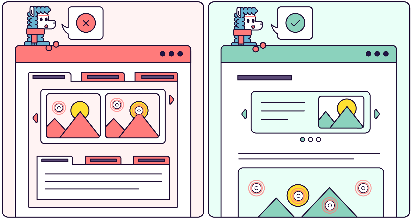
If you’re checking more ✖️ than ✅, it’s time to simplify or rethink the design.
Want more like this? Join our UX Mentorship Programme for Instructional Designers and E-Learning Developers who want to create learning that feels good to use and actually works.

